Transformed Client Experience: Better Days Medical Weight Loss Practice
Tanisha J. Rayson-Henry, founder of Better Days Wellness, reached out with a growing frustration—her website and booking process were complicated, overwhelming, and labor-intensive for both her clients and her team. Despite having a service that addressed a crucial need, the user and customer experience was making it hard for potential clients to take the first step.
Before working with Fierceified, this was the situation at Better Days.
The Result? Confusion for clients, inefficiency for Tanisha, and potential clients dropping off before even booking a consultation. This disjointed system was also causing Tanisha to burn out from all the manual follow-ups and approval processes.
The Goal: Tanisha needed a website and customer experience (CX) overhaul to:
- Streamline the booking process.
- Simplify the client journey.
- Decrease her manual workload.
- Speak directly to the people interested in medical weight loss, using terms and language they resonate with.
The Challenge: Tanisha’s original customer journey was as tangled as a ball of yarn:
- Overloaded Navigation: The website was cluttered with excessive menu options that felt more like navigating a medical textbook than a smooth booking experience.
- Too Many Steps to Book: Clients had to navigate through multiple manual steps just to schedule a consultation. The booking process was a classic example of friction—clients would:
- Visit the website.
- Book an appointment on the scheduler.
- Wait for Tanisha to approve the appointment.
- Receive a manual email with a link to an intake form.
- Fill out the intake form on the website.
- Wait for Tanisha to check the form manually.
Streamlining The Booking Process
We shifted the language on Tanisha’s site to focus on empathy and understanding. Instead of using overly technical jargon that medical professionals would appreciate but clients found overwhelming, we reframed her services in ways that spoke directly to her target audience.
We addressed common challenges her clients faced, making them feel seen and understood. We discussed the frustrations they’ve experienced with other weight loss attempts, recognizing the emotional and physical journey they’ve been through before finding Tanisha.
Streamlining The Booking Process
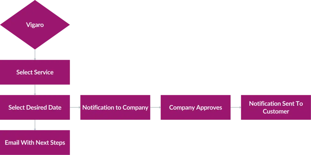
The booking process needed a massive transformation to reduce steps, simplify client interaction, and eliminate the manual back-and-forth that was draining Tanisha’s time.
Now, the process looks like this:
- Book the Appointment: Clients can easily schedule their appointments with just a few clicks.
- Automatic Approval: Tanisha still retains control by approving the appointment, but it’s done quickly through the platform.
- Automated Intake Form: The system automatically sends an email with the intake form, eliminating the need for manual follow-up.
- Integrated System: Once the client completes the intake form, it’s automatically uploaded into the scheduler—no need for Tanisha to hunt down forms or manually check anything.

With these changes in place, Tanisha’s website now delivers a frictionless experience for her clients. The streamlined booking process has significantly cut down the steps, making it easier for clients to schedule consultations and reducing the drop-off rate.
Improved Efficiency
The time Tanisha spends on admin tasks has dramatically decreased. She can now focus more on delivering care and growing her practice.
Increased Client Satisfaction
Clients no longer feel overwhelmed by the booking process. It’s simple, quick, and effective, leading to a better overall experience.
Greater Connection
The new content on the website speaks directly to the challenges and pain points of her audience, helping her build stronger relationships from the first interaction.

Final Thoughts
This case study is a powerful reminder of the impact that streamlined CX and website optimization can have on both business efficiency and client satisfaction. By simplifying the customer journey and making it more intuitive, we’ve not only saved Tanisha time and stress but also created a more engaging and inviting experience for her clients. As I always say: People don’t want to jump through hoops—and you don’t need to either.
This project highlights how user-centric design and data-driven decisions can revolutionize a service-based business, providing a seamless experience that benefits both the client and the owner.

