
When a business owner’s service isn’t selling, their first instinct is to create something new. Throw all this shit away LOL. They never take the time to analyze their 24 hour a day employee, their website. Your website has a huge effect on the likelihood of visitors making a purchase and it could be your #1 low performer.
According to research conducted by the Stanford Credibility Project “46% of respondents reported that they assessed website credibility based on the overall design of the site, including elements like typography, layout, and color schemes.” That means that almost half of your visitors will question your skills due to a poorly designed website. Basically, your site has you out here looking like Joanna Scammer.

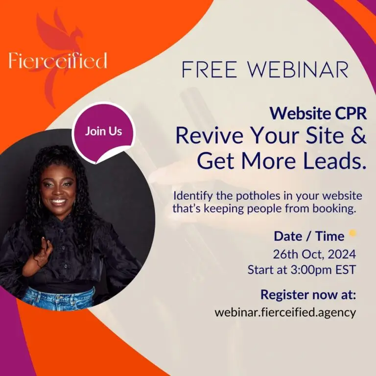
There are some clues that your website is a low performer in the grand scheme of your business. Let’s dive into what those clues are so people aren’t calling you Joanna in these internet streets…….
You send a warm lead to your website and you never hear from them again. If you do not make your design easy to follow they will leave. Once you get people to your site, your site has to tell them where to go. The words and flow should lead them. If people are getting lost on your website it’s because you are not guiding on the journey. Every page needs to have a goal and a journey from beginning to end of the page. Buttons should be clear and precise for example “start now” vs “let’s get this party started” Without clear guidance you will have low website engagement.
You use an over abundance of specialized lingo. Most entrepreneurs create words to call their clients. It’s creative and intuitive, however when people stumble across your site with out getting to know you through social media, they are not going to know what those words mean. Not to mention that they do not help your SEO. If your goal is to have organic traffic, people will not be able to find you on search engines if you’re not using words that people use to search.
An over abundance of animations & pop ups. Gathering email addresses is a hug part of small business marketing strategies, but the email subscription popup has proven to be annoying and a turn off to customers. They interrupt the client journey. Think about how you feel when a website has a few popups, especially when you’re on your cell phone and it is hard to close the popup out. You leave the site right? If they are leaving, that means they are not engaging.
Before attempting to create another offer, check your website to see if you are delivering an easy to follow user experience. If users are not captivated by your website and the interaction that it offers, you will loose them, That warm lead will quickly become cold. The possible lead may never find you because of your word choices or that visitor may leave due to being annoyed by the popups. Review your website to see if it is meeting the mark.
Click here to listen to our podcast, More Than A Brand to learn more about elevating your website.